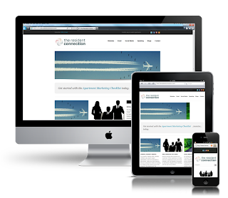
 Responsive web design is no doubt a big thing now. If you still not familiar with responsive design,
check out the list of responsive sites that I recently posted. To newbies, responsive design might sound a bit complicated, but it is actually simpler than you think. To help you quickly get started with responsive design, I’ve put together a quick tutorial. I promise you can learn about the basic logic of responsive design and media queries in 3 steps (assuming you have the basic CSS knowledge).
Meta Tag (view demo)
Most mobile browsers scale HTML pages to a wide viewport width so it fits on the screen. You can use the viewport meta tag to reset this. The viewport tag below tells the browser to use the device width as the viewport width and disable the initial scale. Include this meta tag in the <head>
<meta name=”viewport” content=”width=device-width, initial-scale=1.0″>
Internet Explorer 8 or older doesn’t support media query. You can use media-queries.js or respond.js to add media query support in IE.
<!–[if lt IE 9]>
<script src=”http://css3-mediaqueries-js.googlecode.com/svn/trunk/css3-mediaqueries.js”></script>
<![endif]–>
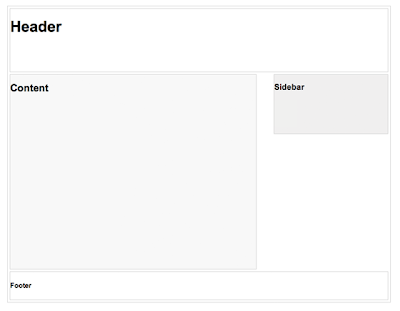
HTML Structure
Media Queries
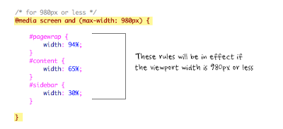
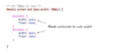
The following set of rules will be in effect if the viewport width is 980px or less. Basically, I set all the container width from pixel value to percentage value so the containers will become fluid.
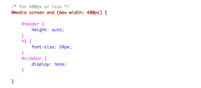
Hi,Designing a web site isn't very hard, but there are some basic things that you need to know about Web Design Cochin or your web site could turn into the biggest horror.Thanks…..
Asia Explore Adventure & Travel is founded by the dedicated explorers and professional Team to operate the luxurious holiday tour and explore the incredible attractions to the various country of Nepal, Bhutan, Tibet and India.We are operating, classic tours, cultural &historical tours, leisure holiday tours,MICE,training& conference tours, Mercedes Benz terrain coach tours, outdoor adventure tours (trekking, hiking, outdoor camping, jungle safari, white water rafting, paragliding etc.), air/helicopter charters, special custom made itinerary tours for outbound travel agencies and provide “one time shop” services to our customers.
Trekking in Nepal
Annapurna Base Camp Trek
Everest Base Camp Trek
Langtang Valley Trek
Mount Kailash Tours
Kanchenjunga Trek
s this type is travel
real estate nepal
travel is very us in
seo in nepal
I ADAMS KEVIN, a representative Aiico Insurance plc, we trust and respect for individual differences in day out a loan. We will provide 2% of the loan's interest rate. If you are interested in this business contact us by e-mail: (adams.credi@gmail.com) now transfer their loan documents issued properly. Do you need a loan to set up business or school if you are very welcome to Aiico Insurance plc. You can also contact us by e-mail: (adams.credi@gmail.com). We first week can request a balance transfer.
DO YOU NEED LOAN FOR PERSONAL BUSINESS? IF YOU CONTACT YOUR EMAIL ABOVE TO PROCEED WITH YOUR LOAN TRANSFER IMMEDIATELY OK.